Showing posts with label design. Show all posts

Sunday, February 12, 2017

Hans Rosling - a tribute


In the past week, the discipline of Data Visualization lost Hans Rosling, a stalwart & leading proponent of Visual story telling. He passed away at the age of 68. That he was a master story teller with data is widely known, and one can get a glimpse of some of these brilliant narrations in his TED page.

A key highlight of all his talks was to demystify statistics and make seemingly boring numbers come out alive on the screen. One of the reasons he stands out in the Visualization world is his unusual combination of diverse skillsets - depth in statistics, eye for visual design and riveting presentation with screen presence.

His efforts have been lauded for taking pains to simplify statistics for the common, non-data audience. He has gone to the extent of explaining heavy concepts like population growth and climate change through Lego blocks and other physical props. Experimenting with innovative ways of presenting data, he had also used Augmented Reality to present data in 2010, several years before AR and VR came into mainstream parlance.

Hans Rosling was a big inspiration for us, in the early days of Gramener. We have leaned on his vast repository of work as part of our talks to educate audiences and in introducing concepts to our clients. Gapminder, the non-profit website and visualization tool that he founded were used as benchmarks in our early work. Over the years, I have continued to use some of his brilliant videos in my Visualization workshops, including one just yesterday.

Thanks to his pioneering work, the industry has benefitted immensely and his legacy will be carried forward. If you're looking to get started with Hans Rosling and his body of work, I'd recommend to take a look at the AR talk from 2010 where he covers 200 years of global history, the wealth and health of nations through a 4 minute talk.


Saturday, January 14, 2017

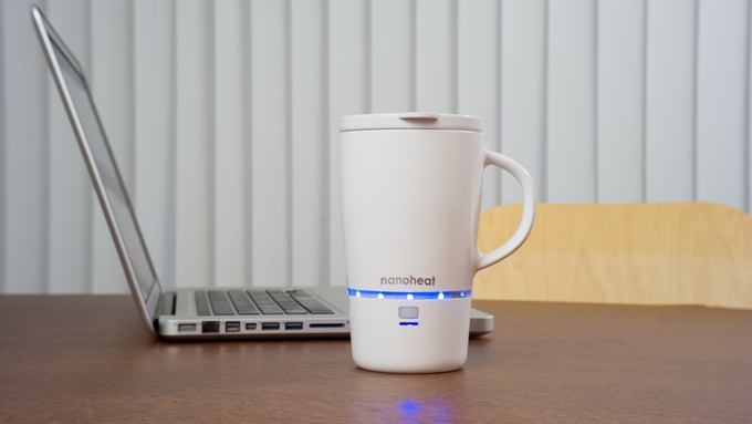
Simple pleasures of having your coffee hot: Some ideas


I'm all for having my coffee or tea extra-hot. Its a disappointment every time, when it quickly loses temperature in the space of a few minutes. And I hate it to finish off the beverage cold or at best, lukewarm.

I am the kind who usually runs back to the oven to reheat my tea when its half done. To confess, there are times I've ended up reheating the same tea a couple of times, before actually finishing it.

This has made me wonder whether there aren't any elegant solutions in the form of a custom, improvised coffee mug.

Googling got me some options. A popular one was the insulated coffee mug, which doesn't really solve the problem.
Thermos insulated mug

Then, there were the reheatable mugs that could be plugged into a power socket or even through a car charger. A bit messy and certainly not one you'd want lying around your table.
Stainless steel coffee mug from Alibaba

I was looking for a combination of a mug -cum- thermo flask that retains heat best, one which comes with a reheat option without those ugly props.
Concept by Green Lama and Design HMI LLC

And, I landed on this page which seemed to offer quite an elegant solution. This kickstarter campaign had originally been launched with some issues, and then relaunched to completion.
Product launched by Green Lama on Kickstarter

With this campaign getting closed, the product doesn't seem to be in the market yet, but with limited availability on their home site.

Looks like I'll have to wait some time until I can have a steaming cup of coffee, all the way to the end!

Monday, November 28, 2016

Evolution of Gramener Design Toolset


Earlier this month, I had written an article in our company blog. I'm reposting it here again:


At Gramener, we have been continuously evolving our Design process over the past years. These improvements have been to stay in tune with the emerging trends in design, adopt industry standard tools and create a custom Design framework that helps us deliver outstanding visualizations.

This post covers the ‘tools’ aspect of the design improvements we’ve implemented, and it discusses the challenges faced and considerations on coming up with a pertinent toolset to cater to Gramener’s core offering of Information Design & Data Visualization.

Earlier Process brief and toolset used:
Until a year back, the primary tool we used during the design phase was paper-pencil for creation of Design concepts, while the actual designs were created on Powerpoint. For most engagements we had a low-fidelity design as deliverable, wherein the paper sketches were translated to a basic representation on MS Powerpoint using snipped images of charts and other basic dashboard components.


In certain engagements, when there was a need to show a closer-to-actual representation, a high-fidelity design was created, again on Powerpoint using imported SVG objects or drawn chart elements. There was almost no prototyping or demonstration of interactivity, save the occasional powerpoint slide transitions. The need for an internal Design library was met by having all designs stored on the Gramener file server and exposed on a searchable, minimalistic UI, that was spruced up with basic previews and meta-tags.


Given the ability of Gramex, Gramener’s platform to quickly pull out charts from the engine’s library and setup a basic, working version of visual dashboards, historically, there was not much of a need for a standardized design tool. Hence, Powerpoint was a quick and light alternative that fit in well with the skillset of Data Consultants, which is a role comprised of functional analysts, who had innate comfort with MS Office rather than the Adobe suite of products.

Evolving needs:
With the evolution of projects done by Gramener and the rapid scale-up in clientele and team size, the need was felt for a rethink of the above mentioned stack. With a large number of first-time visualization adopters amongst clients, we sensed their comfort in reviewing solutions with a high-fidelity design that showed visual design aspects as close to the final solution as possible.

With increasing functional complexity and data size of our visual solutions, Data Consultants had to spend more time in the solution conceptualization and data analysis phases, whereas there was an increased need for additional support during the Design phase.

Challenges faced:
In summary, the key challenges faced with the above simplistic process & toolset were:
  • Variation in quality, finesse and look-and-feel of designs created on Powerpoint
  • Long cycle time for design creation, with an often cumbersome process for putting together the occasional high-fidelity versions
  • Teething challenges in development handover & translation of the design
  • Need for multiple design reviews during development phase, coupled with rework
  • Difficulty in demonstrating state transitions, interactivity and user flow within a visual application concept


Alternate Solution:
Given these challenges and the additional considerations of scalability & rapid replicability, we went about evaluating changes needed in the process, toolsets & framework. We spoke to the design community and took first-hand advice from experts in these areas. From the tools perspective, we evaluated a variety of visual design and prototyping tools including Adobe Photoshop, Illustrator, Balsamiq, Axure and Pinegrow, amongst others. Based on considerations of fitment to our visualization lifecycle, availability of complementary skillsets at Gramener and ability to address the challenges outlined, we zeroed in on the following:

Sketchapp – for Visual Design:
The vector graphics editor from Bohemian Coding has been rapidly gaining popularity and has quickly built its own community of loyal users. With addition of new role of Information Designer at Gramener, this tool helped us in the following ways:
  • We found that the tool was very easy to pickup due to its intuitive usability, perhaps closer to Powerpoint. It also had ample tutorials and a robust support ecosystem
  • By design, the tool was meant to create vector objects and naturally fit in better for dashboards and web applications, while other tools were heavily skewed towards graphic design
  • Has a thriving ecosystem of plugins for productivity improvement, and importantly provides for easy export of style sheets to aid development translation
  • Comes at a relatively economic price compared to popular options, Apple hardware prices notwithstanding


Invision – for Workflow, Prototyping and Design library:
A leading prototyping, collaboration and workflow platform used by several design houses around the world, this tool checked-off multiple items in our requirements list:
  • Provides an end-to-end design workflow solution with useful admin features
  • Has native integration with Sketch and hence it automatically syncs, imports and stores assets from Sketch files. Automatically creates style sheets & enables direct look-up
  • Supports basic prototyping needs to show interactivity and transitions
  • Has useful collaboration & commenting features, and integrates live design presentation and review capability
  • Doubles up as a repository with versioning & hence can be used as a design library


In Summary, below is the overall process that we have arrived at, which has been working well for us and has addressed most of the above-mentioned issues we faced:


Monday, October 31, 2016

Genetic algorithms explained: Evolutionary way of problem-solving


I recently learnt about Genetic Algorithms (GA) and must say I've been quite fascinated by it. This is a two-part blog post on this topic. In this first post I will make an attempt to explain it in non-technical terms, with a simple example to illustrate the concept. The second post would be on applying this technique beyond the realm of business problems - by contemplating on how one could apply this to improving some aspects of our lives.

Now onto Part-1.

I had blogged earlier about Biomimicry, which in simple terms is design inspired by nature. Genetic Algorithms fall into the same category of solving human-faced problems, by getting inspiration from nature's solutions. In other words, this is the discipline of copying how nature operates in a bid to come up with similar harmonious solutions.

Placing Evolution in Perspective

To understand Genetic Algorithms, we'll try and understand the biologics of evolution, by using the bare minimum terminologies. 

  • We are way too familiar with how one generation of humans are smarter than the previous ones. We, collectively are more evolved and (perhaps) smarter than our ancestors, while the same can be said of our kids who are way ahead of us, thanks to evolution
  • Per the theory of natural selection, organisms better adapted to their environment tend to survive and produce more offspring. By survival of the fittest, the more evolved species reproduce more and pass on their genes down the line, while the weaker ones slowly die and get extinct.
  • And, there is this quirky process midway wherein some organisms suddenly have completely unexpected traits. There are the geniuses, those highly regarded people in history of mankind with IQ levels closer to 200, like Leonardo Da Vinci. You've most likely heard of rare people with 6-fingers in a hand, which is also quite unusual. All these are likely cases of mutation, wherein suddenly an unexpected change happens, in otherwise linear, incremental evolution. If this change is strong enough to influence rest of the species, it spreads through reproduction and impacts the subsequent generations. Else, it just stays an aberration and doesn't get passed on. To get this in perspective, think X-Men!
In summary, a species of organism keep adapting to their environment, incrementally evolving and getting smarter. The smarter ones survive and reproduce more, while the weaker ones die. Once in a while, there is a sudden & unexpected change in traits of few organisms within the species and if this is remarkable and powerful enough, it gets passed on to the next generation and slowly spreads to become the defining characteristic of the entire species. Else, the mutated offspring dies and doesn't impact rest of the species.

GA: Application to Problems

What if we try and apply this evolutionary biological process to solve problems in the area of optimization. We can create a computer program that exactly mimics this process of evolution by keeping all the ground rules coded in its entirety, grow solutions from generation-to-generation, until we arrive at an optimized solution that is more efficient than a set threshold.

To illustrate with an example, lets take the popular problem of Travelling Salesman. Given a set of 5 cities that a Salesman has to travel to (exactly once to each city), the problem is to find the route that minimizes the distance travelled by the person. This is an optimization problem and while its simple to solve by hand for the 5 cities, it becomes non-trivial if you increase the number, to say 30 cities.

Applying Genetic algorithm to this problem: 
  1. Start with a population containing a set of multiple random solutions - that is, multiple ways of ordering the 5 cities. 
  2. For each of the solutions in this 1st generation population, evaluate by computing the total distance travelled. Order the solutions from best to worst (within this iteration).
  3. Select the top 2 or 3 solutions with their ordering.
  4. Marry within this solution by randomly exchanging routes between the solutions (while sticking to ground rules, such as no repetition of cities). This step mimics the reproduction or recombination, as it happens in nature.
  5. The above step creates the next generation with a set of new potential solutions.
  6. Once in a while (say every 10th iteration), introduce mutation by performing a random operation. For example, you could swap every pair of cities in the route created until that step.
Repeat the same process from step #2 through #6 above, until you arrive at the solution with the lowest distance travelled. Each iteration is the equivalent of one generation and through the process of evolution, each subsequent iteration would have atleast some solutions which are slightly better than the earlier ones. You might iterate through this 100s or 1000s of times depending on the problem, but this process is guaranteed to come up with the most optimal solution.

Summary

The fascinating aspect about this technique is that you can arrive at the best possible solution, and possibly the global minima to any optimization problem. You just need to code this in the structure & process as outlined above, and without getting into construction of complex mathematical equations or their solutions, you can get the best solution through an evolutionary search procedure. Check this article for a more detailed explanation. They seem to be applied to a variety of real-world problems, and they sure hold a lot of promise.


Tuesday, June 07, 2016

Data journalism through Visual analytics to cover India's electoral battles


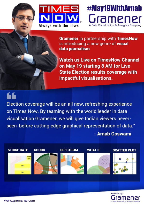
19th of May was a momentous day, not just for the parties that swept to an absolute majority in the 4 State Assembly elections in India, but also for Gramener, which made a splash on national Television by covering the elections through visual analytics. With Gramener's partnership with Times Now having been forged hardly 6 weeks prior to the counting day, it was a daunting task to deliver insightful & engaging data visualizations, for the real-time streaming results of the votes tally. The most critical ask was to have this data journalism initiative designed and packaged in a way that it reaches the non-tech savvy, TV audience - millions of them, considering the clear leadership that Times Now has in the English News Channels segment.

The last similar outing for Gramener, at a comparable scale was during India's landmark 2014 Lok Sabha elections, which witnessed BJP's landslide victory. Then, we had tied up with CNN IBN TV channel, through a partnership with Microsoft. This was a big success as well, but very different in terms of the type of engagement and reach. The CNN IBN initiative was two-pronged: TV and Digital. The visual content was created as an interactive application and used for live reporting by anchors on a touchscreen TV. Then, there was the end-user-targeted Election analytics app, which was launched on the web through multiple channels - Microsoft Bing, Windows 8 app on the appstore and the CNN IBN website.

The content on TV was used more as an add-on reporting by anchors, while the main action and live debates happened in the primary studio, led by Rajdeep Sardesai, through their traditional means. There was good response to the visual reporting on TV , however the major reach was through the Digital channel, where we received over 10 million hits just within the 16 hours on the counting day.

For the recent initiative with Times Now, TV reporting was the only medium leveraged and as if to compensate for this, the visual analytics was integrated mainstream into all of the channel's programming. All reporting through the day, prime-time coverage and live debates were tightly strung together with our product's visuals. 

And hence, the stakes were really high and our team had put in extra efforts to make this work on national television, with just a single opportunity to get it right in front of millions of live TV audience.

Reflecting on how things progressed on May 19th, what a day it was! The Gramener product's visual analytics was synced with the Times Now programming and everything worked out to clock-work precision. The visuals got a major boost with a pre-launch premiere on the 18th, a day prior to going live. There was very good visibility for the Visuals and ample co-branding for Gramener. Thankfully the 5 Visuals helped identify early trends, while the analytics helped give a clear picture of the evolving scene in each state, which in turn spurred a lot of meaningful debates. 

As a bonus, couple of us got to participate in the show and contribute to the data stories on prime time. An equally enriching experience was in the On-Air backroom, to get a first hand experience of TV production. It was something to view from close quarters the zillion moving parts - video feeds from all over the country, editorial team live-feeding & curating the content, graphics team sending their animations & graphic designs, in-studio cameras shooting people at all angles, apart from several other technical teams editing and mixing all the content. It was amazing to see the technical mastery on how the show director and producer work through all this chaos, manage things on-the-fly and create a supposedly seamless and perfectly unified experience for viewers, on the screen!

There has been extremely positive reviews and feedback flowing in from various quarters. It was a delight to get additional reinforcement of the effectiveness from the all-important TV ratings, which is a gold standard to judge the popularity of shows.


Perhaps, there will be separate posts on the making-of-the-show: the preparations, technology architecture and on the production aspects. For now, do check out the below post by a colleague, which gives a good summary of the entire engagement.


Sunday, December 13, 2015

Making healthcare solutions exciting through Design


Marketing of healthcare services is a tough nut to crack. How do you communicate complex services to a lay audience? How can healthcare problems with morbid connotations be made palatable? Even if you manage these, how do you improve engagement level and brand recall by making this exciting?

Yashoda hospital has solved this quite innovatively, through refreshing ad designs, that use:
  1. Creative symbolism to simplify the complexity of problems, 
  2. Terse captioning with simple words to capture the essence of solution
  3. Brilliant graphic design leveraging loads of white space
The big billboard ads put up by Yashoda hospital in various parts of Hyderabad in the past months were unmissable. Check out some of the more notable ones here:


All Pictures sourced from Yashoda hospitals channels on FB, Twitter, Google+

Sunday, November 22, 2015

Great design of everyday things


Humming bird fork stand. Pic: Amazon
I came across this fork stand recently, and there was something about it that caught my attention at first sight. Its beautiful to look at, serves its purpose as a fork well and its quirky design makes you smile. The design is so intelligent that a set of forks kept stationary on the stand double up as a set of birds perched upon a tree, while the fork impaled and ready to be eaten looks like a humming bird feasting on a fruit!

Perhaps as David Norman explains in his book on Emotional Design, this caters to our senses at 3 levels - 'visceral' or 'the beauty aspect', 'behavioral' or 'utility & usability factor' and 'reflective' or the 'emotional connect'. The story-telling aspect of the design was amply reinforced by the fact that my 4-year old kid who refuses to eat fruits, now looks forward to his fruit-eating sessions, thanks to this fork set! 

Saturday, October 31, 2015

Biomimicry: Solving today's problems with a million-year old blueprint

I attended this workshop on Biomimicry at the Lift India conference in Bangalore today. This workshop was run by people from the Biomimicry India lab, Prashant Dhawan & Seema Anand. It was an enlightening talk about a interesting concept that holds huge potential.

Source: Biomimicry india website

Biomimicry is innovation inspired by nature. In other words, the fundamental premise is that today's problems have solutions all around us - in the form of nature's tried and tested blueprint that is millions of years old. Here is a 2-minute video explaining the concept. In the words of this movement's founder, Janine Benyus, natural organisms have managed to do everything we want to do without guzzling fossil fuels, polluting the planet or mortgaging the future. So, we need look no further than our surroundings to solve some of the most puzzling problems we encounter.

Pic source: Asme.org
A classic example cited to highlight success of this concept is the redesign of Japan's bullet trains that were super-fast (300 kmph) but had the issue of causing sonic boom while exiting tunnels. This was due to the bullet shaped nose, that resulted in the high noise levels. This was solved when the train's chief engineer, Eiji Nakatsu observed the splashless, graceful entry of a Kingfisher into the water, based on which he redesigned the train's nose mimicking the bird's beak design.

Here is a nice Ted Talk by Janine Benyus on Biomimicry along with some striking case studies inspired by nature, and here are some more resources to explore.


Friday, October 30, 2015

Design for a better world


I've been dabbling in design and related disciplines as part of my work over the past 5 years. This has been across areas such as Information Design, UI-UX and Dashboarding, primarily for solving the problem of data consumption. The focus has been on practical application of these disciplines across several domains, variety of user groups, different devices and form factors. 

Quite recently, I've renewed my focus in this area and have been trying to delve deeper in the discipline to understand what makes anything functionally better, easier to use, while also driving up the emotional connect. There a lot of questions bubbling up at several levels in my mind that I'm struggling for answers. Here is a sample: 

  • How do you bypass the clutter and engage directly with your target audience? Why do things have to be unpleasant 
  • Why do you have to teach anyone to use a computer, while most people don't need instructions to use basic functions of a mobile phone?
  • How do you make new technologies seem undaunting, or rather more inviting for the majority of people?
  • Why should we live with daily irritants, for instance, struggling to identify the right switch when you want to turn on lights in a room?
I will keep sharing more thoughts on these and also a profiling of good and bad designs that I bump into.

A world without user manuals, sign boards or loud announcements, one where thoughts can directly translate into actions, is perhaps a better designed world.